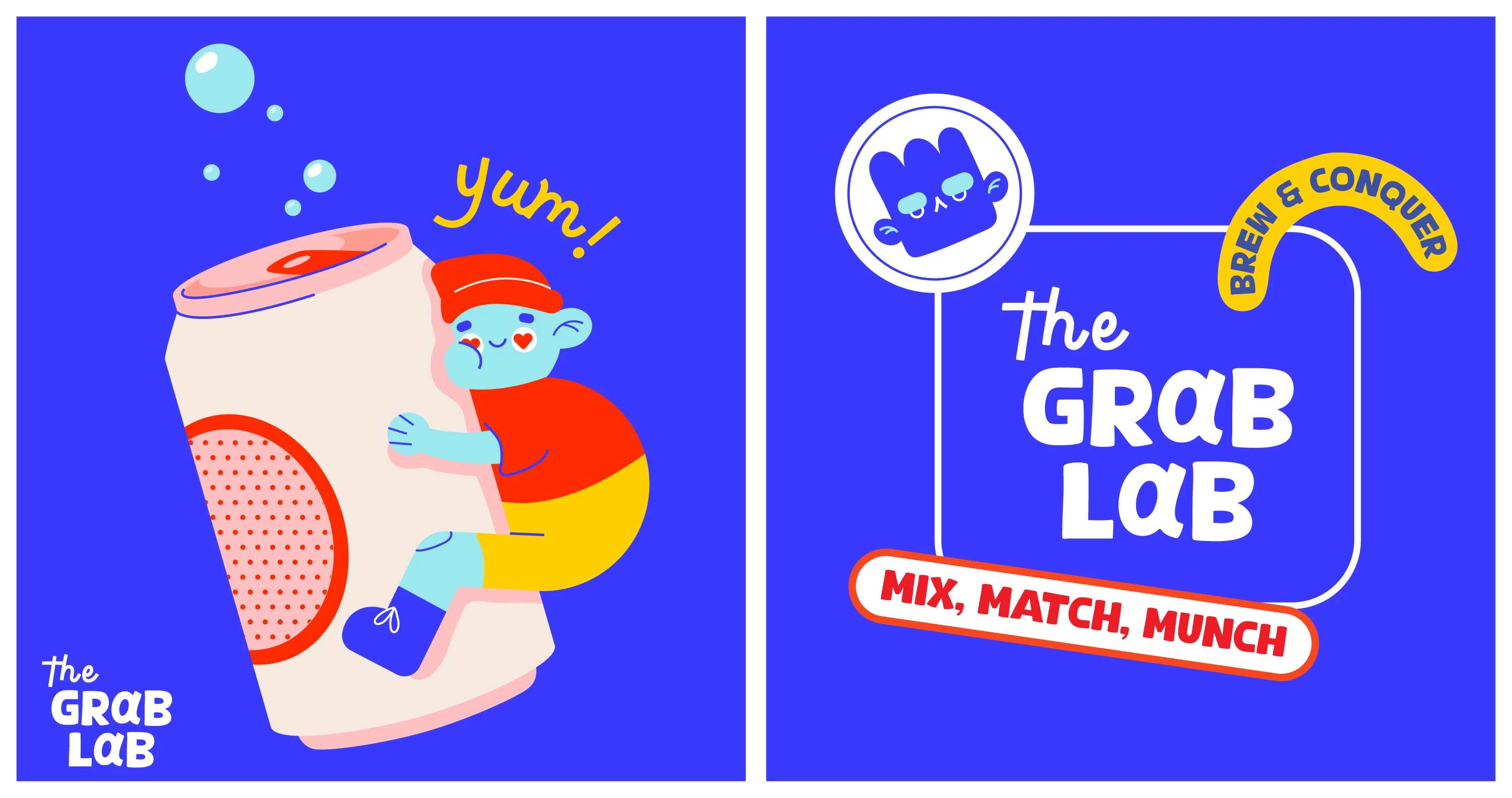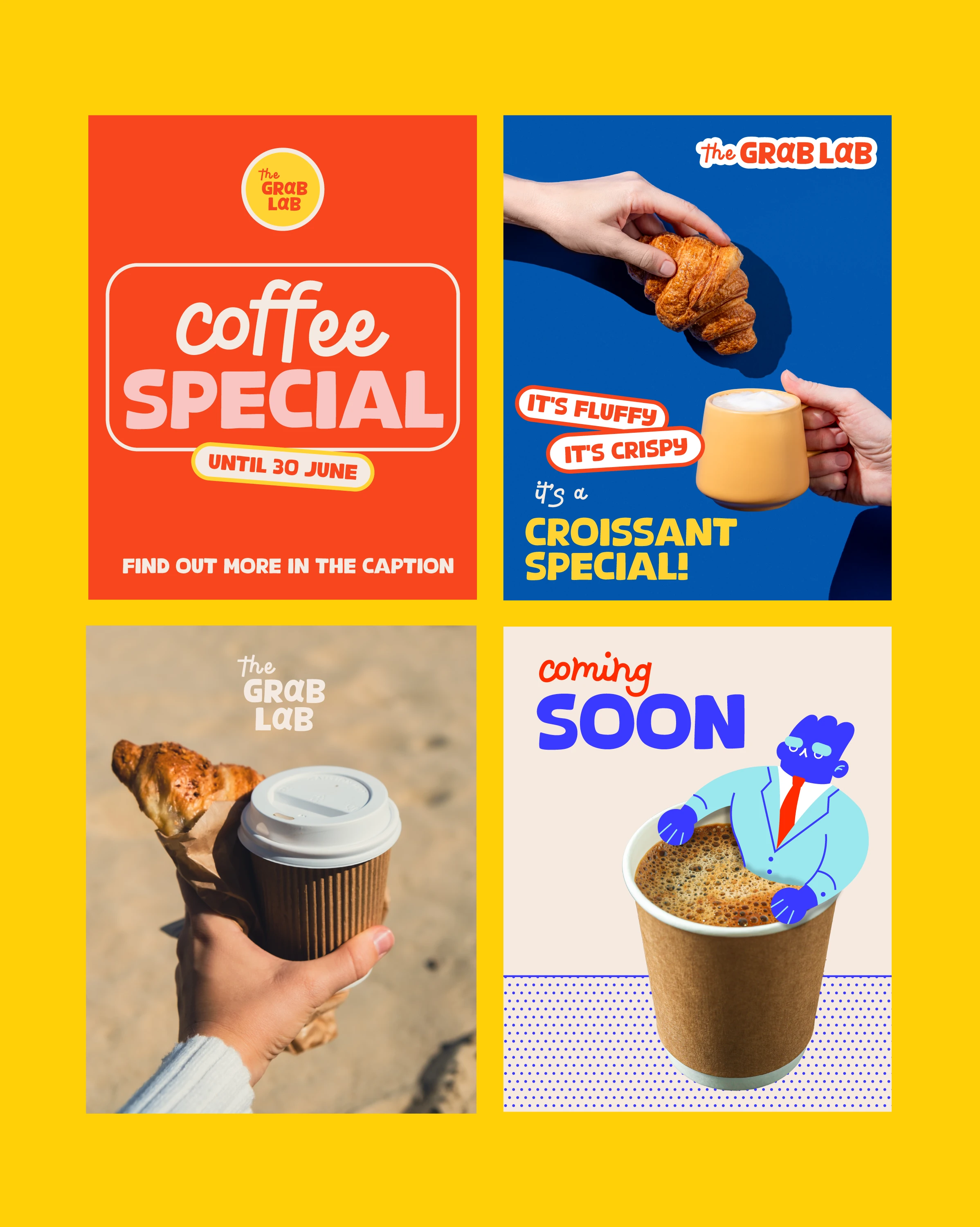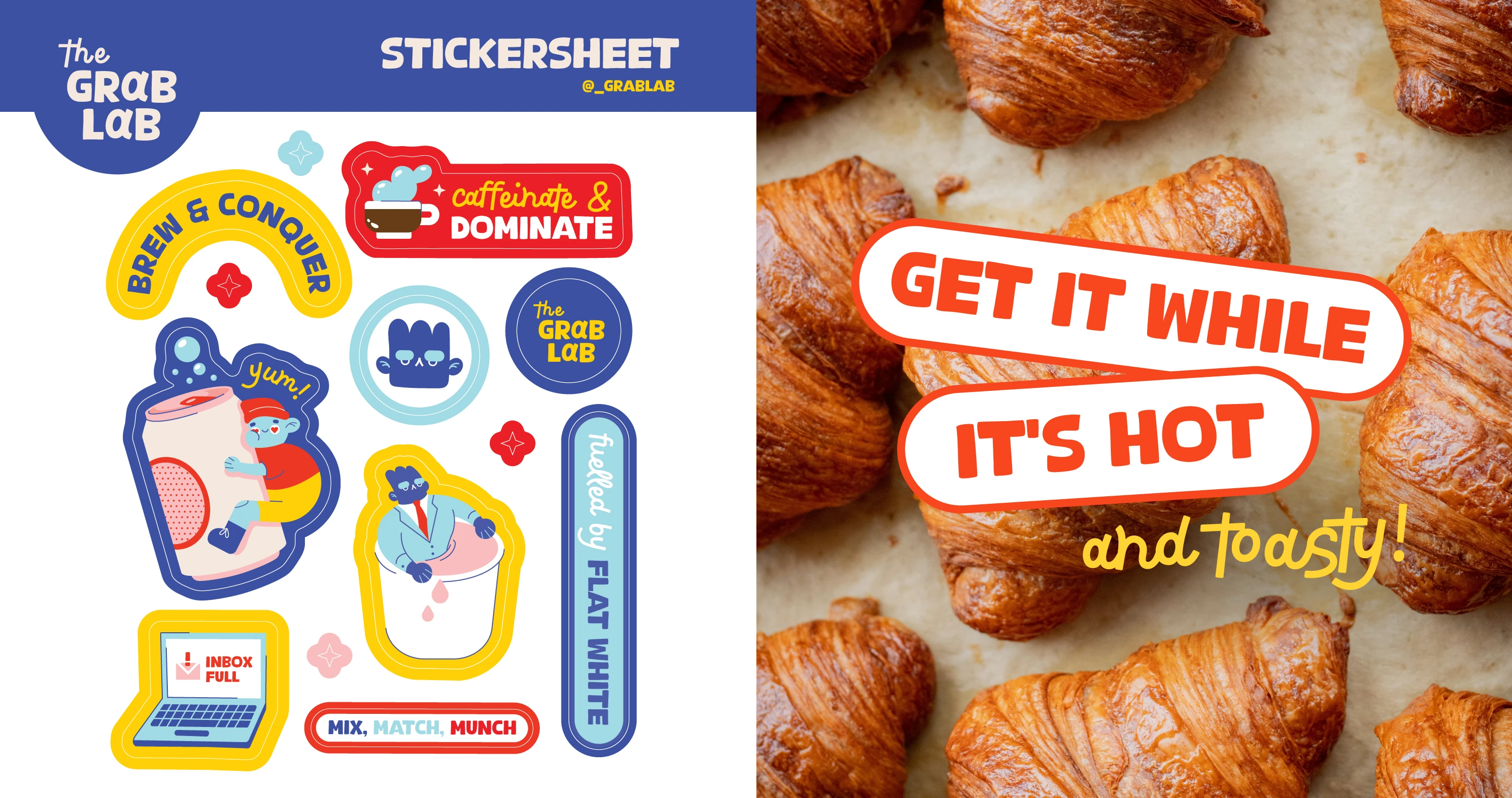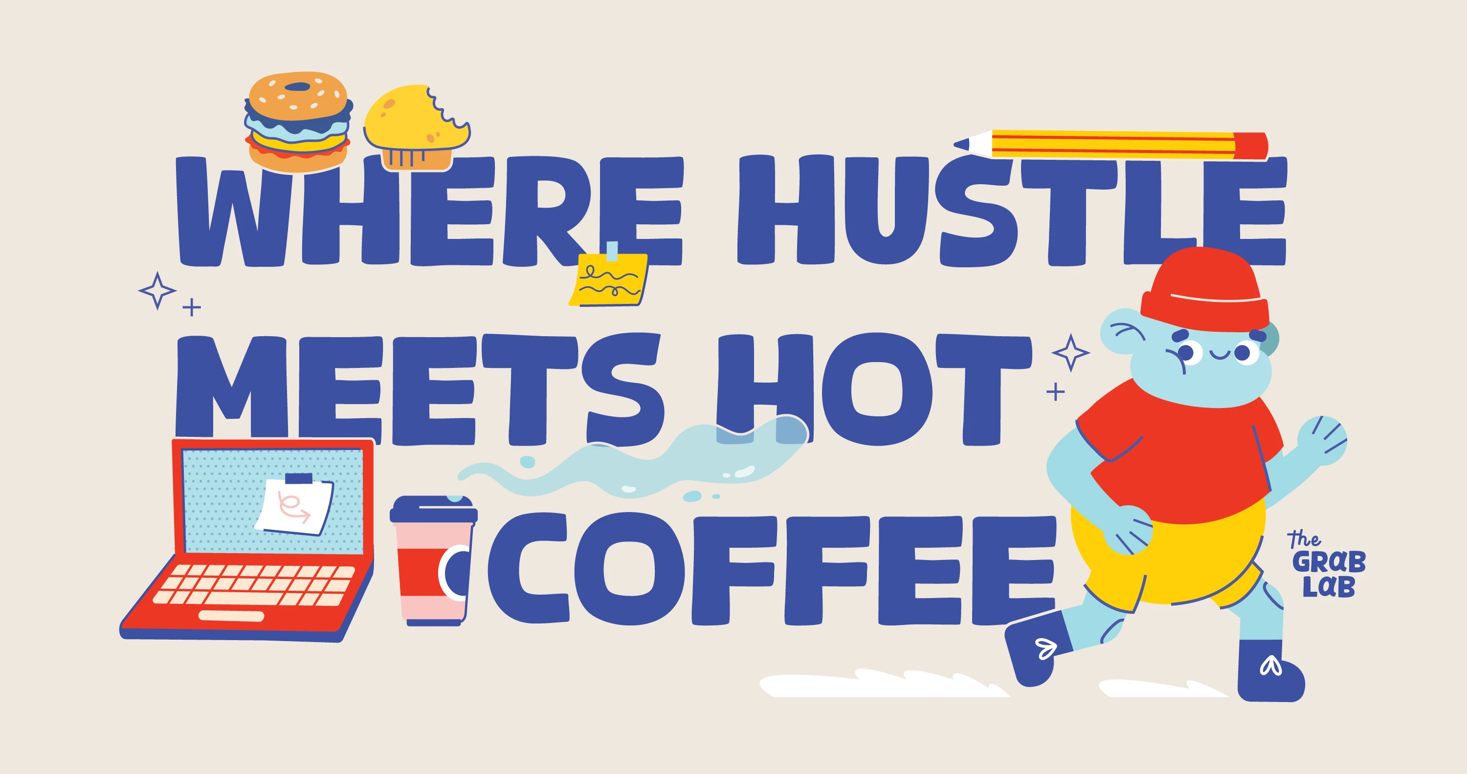
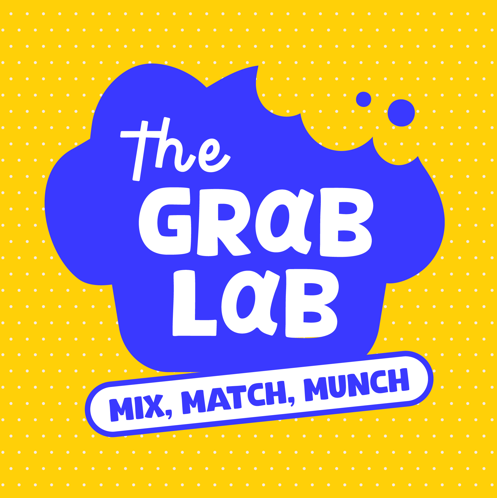
Say hello to The Grab Lab's bold new look!
We had a blast designing this logo with equal parts quirky, clever, and full of personality, built for a brand that never takes itself too seriously. At the client's request, we leaned into a chunky, expressive font and paired it with a whimsical doodle-style typeface to reflect the brand's playful vibe. The two styles work in contrast rather than matching perfectly, one bold and confident, the other loose and hand-drawn, creating a mark that feels dynamic rather than uniform. Special attention went to the letter "a" in both Grab and Lab, giving it that little extra flair it gets when spoken aloud, a small detail, but the kind that turns a wordmark into something people notice and remember. A fun brand with a lot of character? Yes please. We loved every second of bringing The Grab Lab's personality to life, one playful detail at a time.
Logo Design
Illustration
Branding