A Star System, By Design
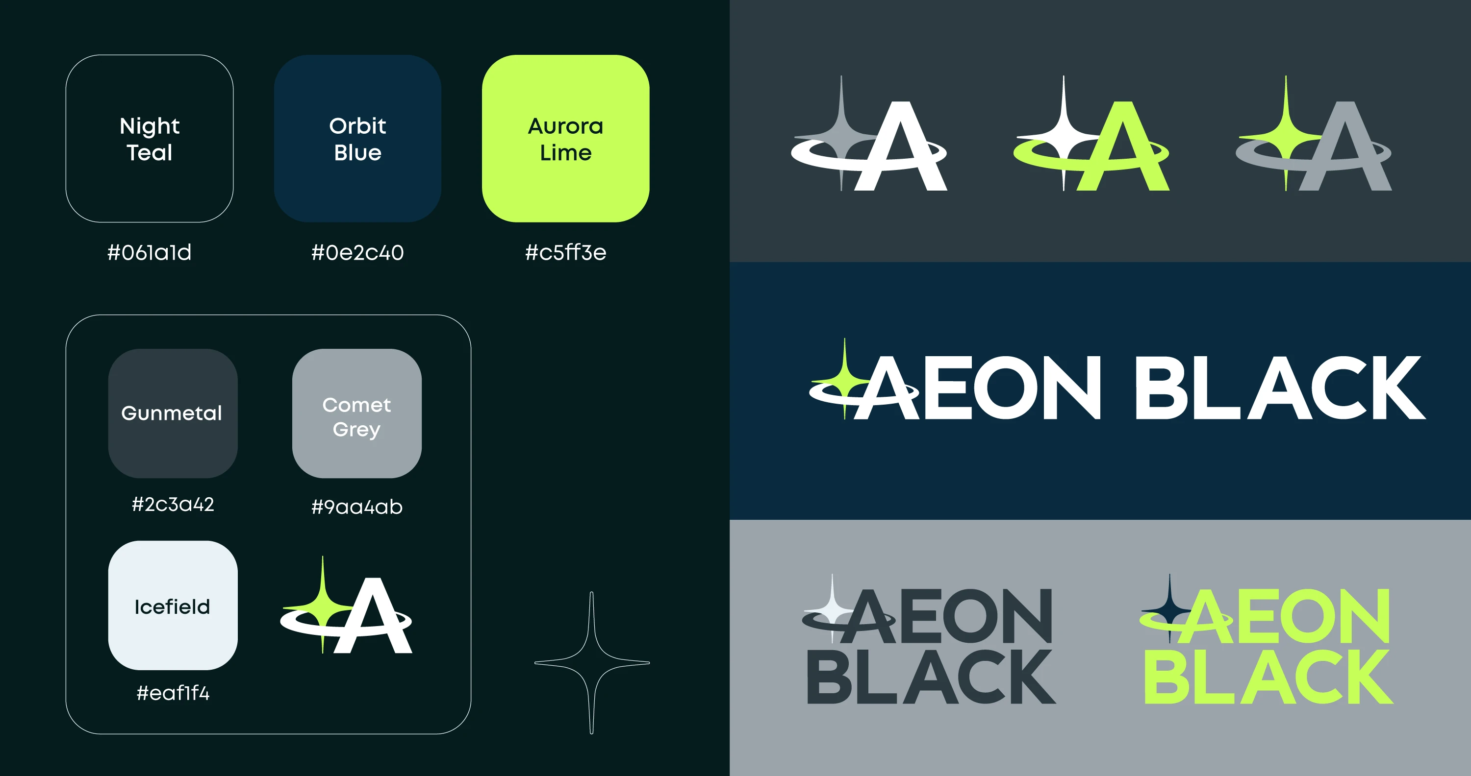
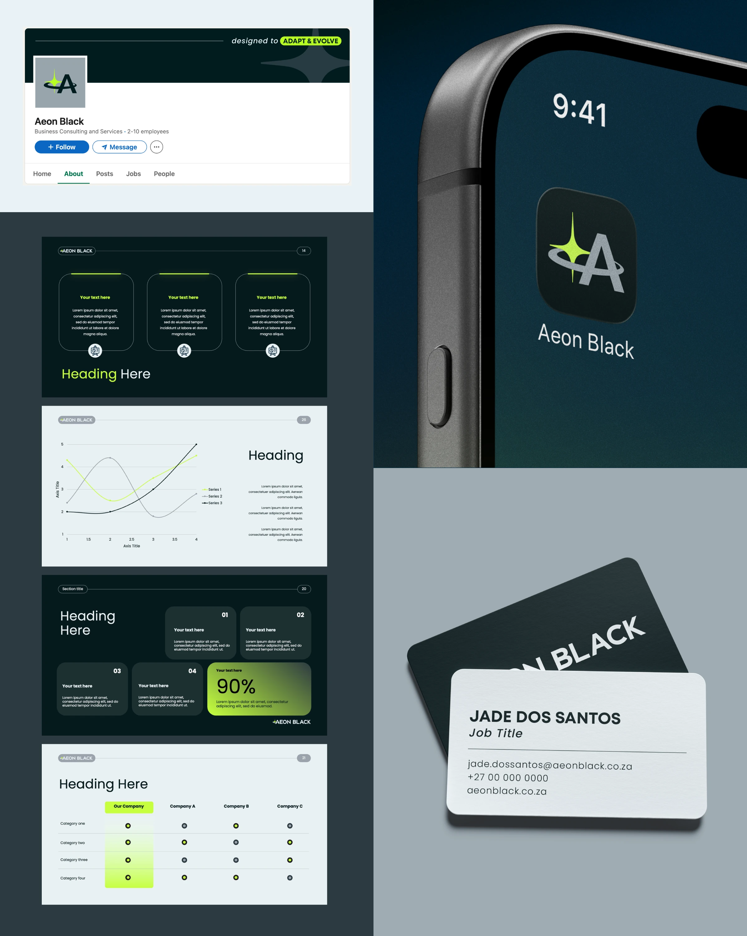
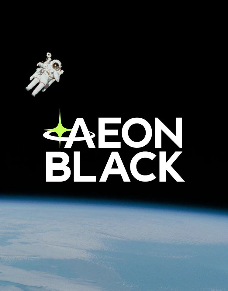
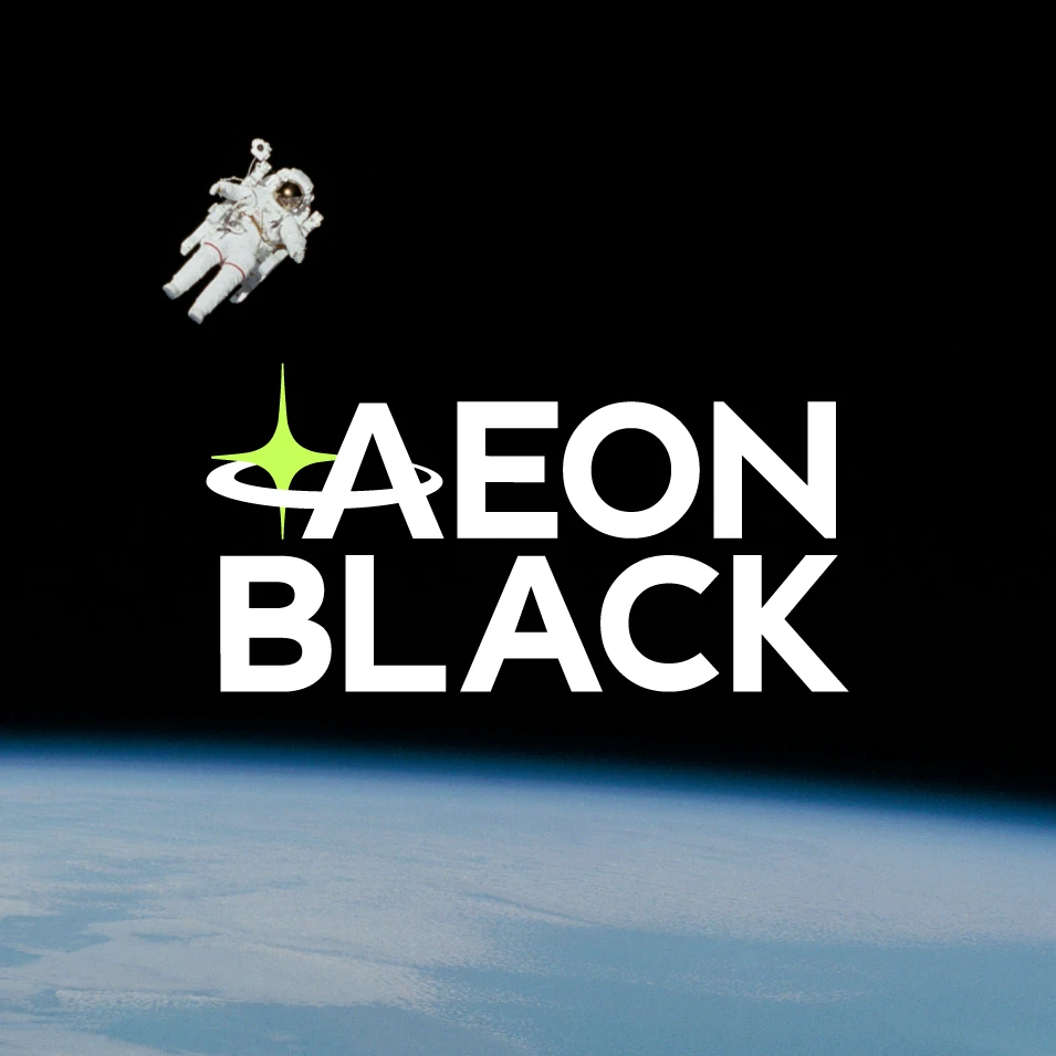
Working alongside Aeon Black, we developed an identity that considers motion and grounding in equal measure. A balance rarely found in financial branding, where permanence is often mistaken for rigidity. Stars hold their position through balance, not through resistance to movement. The star represents alignment and support. It became the starting point for a brand system built the same way: one that revolves around its partners, not the other way around. Every touchpoint, from the mark itself to the wider visual language, was designed to hold that principle and flexible enough to move with Aeon Black as it grows, structured enough to stay recognisably, reliably itself. The result is an identity that behaves less like a fixed emblem and more like a system in orbit: grounded, aligned, and always in motion.
Branding
Graphic Design